Designing for commercials has its own unique set of challenges, inherent in the medium's fast turnaround and client relationship. We asked our colleagues to share their experience and advice.
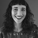
Latisha Duarte
"You have to be on your toes, ready for the next thing, whenever that project firms up or comes at you out of nowhere."

Chelsea Oliver
"In my experience, even with the proper budget for a build, sometimes reworking a location is the better choice."

Dylan Kahn
"My approach emphasizes positivity, pragmatism and proactive management."
Pablo Tregebov Poza
"I'm romantic about commercials."
July 13th, 2024
How do you design for commercials?

Latisha Duarte
Latisha Duarte is a New York City-based production designer originally from Cape Town, South Africa. With a BFA honours in production design, she’s worked in the film and TV industry for over two decades, specialising in TV commercials but with experience designing features and music videos. Recent commercial credits include NBA, SK-II, Nike, Stella Artois, Range Rover, Pantene, Apple, Facebook, Coach & Lancome.
Designing for commercials begins in much the same way as designing for film and TV but rather than being a marathon, it’s a sprint. The biggest challenge most often is time.
I jump in by reading the script and the treatment a few times. I am often brought on in the bidding stage to help budget the project; although I'm not paid for this time, I consider this an investment in my future. If the project then awards, I will inherit a workable budget and have had the luxury of time to understand the concept and have allowed ideas to marinate. During the bidding phase, I distill the project into its essentials, whether we are building the world on a stage or location and understanding the objectives of the various players (directors' dream vs producers' reality vs agencies' vision vs clients' deliverables). I'm often sent the director's treatment before the treatment writer has had a pass at it, and there are no images. I quite like reading the director's thoughts in their rawest form; it's one of the few times I am not bombarded with other creatives references. I can allow my imagination to do its thing. I try to do some initial research before seeing anyone else's. Usually, within a day or so, I receive the fleshed-out director's treatment with all its revisions, references & moods, and this narrows down and informs how I will approach the project and budget for it. Designing for commercials can be many things, but I always aim to thread the director's vision into the tapestry of the script and product with the limitations of resources. Concept and story first to determine the look and feel.
I like to write down all my thoughts during this phase, then after a pause, go back through them and pull out the questions I have. Pencil and paper are my go-to at this time, thinking with a pencil and being able to scribble back of napkin sketches and ideas for spaces. I then type up the essentials so that, down the line, I can share the notes and creative thoughts with my team when they are welcomed onboard. At the same time (and throughout the project), I refine a more nuts and bolts breakdown for my team in priority order. This way, everyone can easily access the same information. I allocate tasks in the shared note. This shared note contains all the links to treatments, scripts, location folders, dropbox, the wip art deck, and the budget. I usually start the art deck at the same time as I start the bid. It's an ever-evolving document, and I use it as a tool to track idea development and review sourcing. It also means I never have to worry about having an art deck for a PPM because it's always ready. When it’s time for the PPM, I’m usually on set with my team and have no interest in being stuck behind a screen. Everyone has access, initially, just my art team and then once the art deck has taken shape, I share it with the director and production (and PAs doing pickups). The agency can comment directly on the document once my director is happy.
There isn't much time during the bidding process to research extensively. I steal away some time to pull key moods and references that inspire ideas or speak to something specific in the brief. I always work closely with my ADC when bidding. We work exclusively on Google Sheets for bidding and tracking budgets and Google Slides for the art deck. That way, the information will always be live and up to date for the team to access.
Commercials are a curious path, unlike a more traditional job where you can anticipate what lies ahead; with commercials, you have to be on your toes, ready for the next thing, whenever that project firms up or comes at you out of nowhere. It's often a lifestyle that lacks routine and is one of extremes, so I instill routine and structure between projects and within projects. Having personal structure through regular daily writing, exercise, and spending time outside helps me feel ready for anything (with a smile, hopefully) and able to respond in a fluid, flexible and creative way to the needs of the job. The systems & workflow I have in place for commercials are pretty simple, keeping all the information accessible to everyone. Information that may not seem relevant initially may be crucial down the line. I draft an onboarding email to the whole team with the shared note with all the links, and the online live budget and deck create the working parameters specific to that project. My team are my greatest collaborators and problem solvers.
My most recent projects, each a unique extreme, have been invaluable learning experiences. In the diversity of these projects, I found new approaches and discovered magic.
I was called on a Friday afternoon to create inserts for an NBA project that needed to be shot on Wednesday morning. I know from experience that I can only take on those quick turnaround projects if I am well-rested and ready to take on the world. I felt up for the challenge and was excited at the opportunity to work with director Dave Laden. We had to shoot inserts with Queen Latifah and WNBA players to cut into a longer NBA Final commercial that had already been shot in LA. I'd never done inserts for someone else's work and was curious how that would go.
Ultimately, the creative process was much the same as any project. I started with research; after studying what had been filmed and cut together, I isolated what we needed for the inserts and put some numbers together. LA designer Dylan Kahn and his team did an incredible job creating a Great Gatsby meets NBA Final party at a high-end 1920s club location, a luxurious black, white and gold affair. The look had been established, and our task was seamlessly integrating Queen Latifah into that world. I could not speak to the designer during the process, mainly due to the insane turnaround time, but Kahn's design work was clean and meticulous. I was able to get almost everything I needed from the edit. His ADC was very helpful, too. The research isn't always what you might expect it to be. Reverse designing and only having one day to do it was tricky but fun.
After submitting an estimated budget late Friday, I didn't hear anything more about the project until it booked the following evening. Between Saturday night and Wednesday morning, we worked tirelessly, and everything happened at lightning speed. My strategy was to design with simplicity and dazzle with lighting. Our incredible set decorator, Keri Lederman, with the backup of the indispensable Kim Fischer, was able to locally source existing light fixtures that closely matched what had been established in full-length spot. Those fixtures did a lot of the heavy lifting for the Queen Latifah insert.
I had never done this before, but because of the time constraints for the builds, I used MidJourney AI to create some mood references for the build of Queen Latifah singing from a low angle. Once I had some references I liked, I shared them with my illustrator, who was able to render what I wanted very quickly. Initially, I was conflicted about using AI, but I viewed it as a quick communication tool to streamline the rendering process.
8 am Monday morning tech scout, booking dressing and printing graphics by noon, and we were already offloading the truck on the stage that afternoon. On Tuesday, we built, dressed, and prelit for the 5 am call on Wednesday morning. It was pretty miraculous. I witnessed teamwork at its finest, support, and thoughtfulness from each department on every level. It was somewhat of a love affair. The New York crew flexed its excellence.
The next project I was called for was the opposite. I had so much lead time that I could hyper-focus on the minutia of the colour red. It's an unreleased beauty spot, so I can't say much more about it except that we shot an all-red world with red shapes. For days on end, I focused all my attention on the colour red, which was a delight. Red has always fascinated me, the history of the pigment in trade and its significance and relationship with beauty and power. The client provided the Pantone to colour match the paint but sent me two Pantone codes, which was curious. I spent a lot of time at the paint store, having them scan Pantone chips and mix samples in various finishes before settling on the perfect colour. Our scenic also needed to do four coats before I was happy. The intense pigment required more layering of paint.
No two projects are alike; the last two were on a smaller scale, but every project calls for meticulous attention to detail, falling in love with the subject and going from novice to expert at the speed of light. Understanding the needs and coming up with creative ideas and solutions with the backup of a talented team makes designing commercials a nugget of joy, often wrapped in a layer of sleep deprivation and stress. I always strive to stop, turn to my collaborators and check that our approach is the best one. Is there another way to execute this idea? Is the alternative better? Smarter? More effective? Is there a more sustainable approach? These questions often haunt me long after the project is complete.


Dylan Kahn
A native Los Angeleno, Dylan Kahn has spent the last two decades honing his production design skills on some of the most memorable and perhaps unforgettable commercial campaigns all over the world. His enthusiasm and passion have earned him multiple ADG Award nominations, as well as an AICP Award for Best Production Design (housed in the archives at MoMA). Kahn continues to welcome the exploration of new visual concepts and creative relationships. He is an active member of the ADG Commercial Committee.
Designing for commercials is a bit like riding a bicycle. It demands a delicate balance of skills, unwavering attention and always keeping an eye on what's ahead.
I’ve spent the majority of my career in short format and have worked on more commercials than I can remember, some memorable some forgettable, all of them with their own unique set of challenges. I’ve been fortunate to have the privilege of crafting commercials worldwide, collaborating with incredibly intelligent and creative people. We have all struggled.
Essentially all filmmaking is an exercise in practical problem-solving. I think one of the greatest lessons I’ve learned in my global production experience is no matter the challenges, or the resources, generally the simplest approach proves to be the most effective.
In commercials the expectation of the production designer is to create the same beautifully layered cinematic production value as our colleagues in long format. However, with only a fraction of the time, and often with a much different set of resources. This often requires the designer to be decisive, confident and prepared to defend both their own ideas and their director’s vision. Design is one component of the designer’s mission but solving problems big and small is often the bulk of what we do.
While the role of a production designer in commercials shares similarities with long-form filmmaking, the compressed timeframe and diverse stakeholders introduce distinctive challenges. Collaboration extends beyond the director to encompass ad agencies and its clients. This can create a complex landscape of competing interests to navigate. This is where having an open mind, and the ability to understand multiple perspectives is central to success.
Just as the time to design and produce the projects is extremely fast, so are the finished spots. Visual storytelling must often be robust enough to convey mood and message swiftly, sometimes even overshadowing performances due to limited screen time. Designing commercials involves recognizing that your design will be repeatedly viewed by large audiences, and your choices will significantly impact how effectively the commercial resonates. This integral difference between short and long format, makes it so that every frame is extremely important and requires carefully considered choices.
Although each project requires a different approach, I consistently try and employ the same principles to each project. My approach emphasizes positivity, pragmatism and proactive management. Acting not only as a designer, but also as a quality controller and motivator, I prioritize achievable goals while nurturing creativity within the team, as well as communication with the other crafts. I see myself as someone who speaks many languages, the language design, practicality, construction and filmmaking, but also the language of advertising and marketing.
Commercials can be chaotic, with constantly developing creative and layered approval processes. I find it important to remain flexible in what I design and how I approach each set. The one constant in life and in commercials is change ... Building-in a contingency plan and being prepared for things to change often leads you to the most efficient approach. Surprisingly it also often leads you to ideas you hadn’t considered and challenges you to think differently.
For me that’s where the magic is … The moment you challenge yourself and see something new.
So, when challenges arise - like falling off a bike - the key is to dust yourself off and keep riding forward.



Chelsea Oliver
A Los Angeles native, Chelsea began her career designing music videos and commercials whilst simultaneously working under great production designers on studio films. Now a designer for nearly 20 years, her commercial work for Apple, Google and Nike have been recognized by the Art Directors Guild and Cannes Lions among others. Her first full-length feature, "Embers", was nominated for Best Production Design by the American Independent Film Awards and traveled to more than 40 film festivals globally.
I’ve always appreciated the speed puzzle of commercial production. Many essentials come together quickly: client brief, agency concept, director’s approach, etc. All must be fine-tuned and executed in a stunningly short timeframe. I have designed many commercials where I am overseeing a build, vehicles, SPFX, the usual sectors of the art dept and planning with VFX, sometimes with only a week or two to prep.
Yet, in creating commercials, our role as production designers is often problem solver first, storyteller second. Everything is compressed. I strive to tell the story visually, that must be the priority. Setups might only last a few seconds on screen, so each frame must speak volumes.
In my experience, even with the proper budget for a build, sometimes reworking a location is the better choice. Resources can be allocated to elevate the overall look and convey a clearer story. For instance, modifications by construction and scenic painters may drastically alter the appearance of a space, make it unique.
Here are a few examples of commercial projects where we utilized locations instead of a build. To illustrate, check out the accompanying images with both a location photo from scouting and a corresponding set still.
BRAND JORDAN “ Breakfast Club”
The script for this campaign from Wieden+Kennedy was inspired by Michael Jordan’s notorious Chicago Bulls training “club”. Our film starts outside of a pawn shop called “Rings” as nod to the many championship rings the brands athletes have won. And very quickly we realize this is a front for an elusive training gym. We pass through a corridor with custom keys on plaques for each of the storied athletes who train here. And finally enter a customized training facility where we meet other athletes already hard at work.
Director Dan DiFelice envisioned a cinematic approach for the film, so the transition from street to the gym needed to flow realistically and the reveal of the gym feel substantial.
After a few days of scouting we landed on a defunct bank location for the training gym. Its marble columns provided scale and substance, and made it possible to extend the set in post if needed.
We covered the floor completely with new black rubber, brought in the high design gym equipment and plugged the windows so that our practicals and lighting design further enhanced the tone.
The corridor of keys needed to present as premium and completely customized. Early on Dan had designed a walking shot of our hero athlete Dez Bryant entering the gym so it was also necessary that space be attached to the gym. We dedicated a small area of the bank location and built a partial set to accommodate. The keys were an opportunity for the brand to call out certain athletes training on site but also to nod to the brands’ iconic Jumpman symbol. The prop master and I developed a key design that could be fabricated very quickly to work practically on set. These were such a hit with the client that later hundreds of replica keys were made for promotional distribution.
None of the pawn shops we scouted were the right fit, so we rented a small empty retail space we could fully dress and control. Rented jewelry cases were filled with Championship Ring replicas, peg board walls adorned with small easter egg-type nods to Michael Jordan and the legend of the Breakfast Club training club. We see Dez Bryant use his Jordan key in a door inside the pawn shop to access the gym. DiFelice wanted a shot of a very elaborate locking system that would serve as transition from Pawn Shop to Key Corridor. For this we sourced a variety of smaller practical locking systems from bank vaults and safes. Each were filmed with their moving parts and these were combined in post to create an elaborate vault system inside the door.
MASTERCARD “Spotlight”
This commercial features Mastercard’s specially designed cards for the visually impaired. We follow a partially sighted person on her daily morning walk to the local coffee shop where she uses her specially designated card. A spotlight tracks with her, serving as metaphor for her limited range of vision.
Originally scripted as vignettes built on stage, both Director Fredrik Bond and I knew we would need scale of buildings and travel distance for this to feel like an authentic neighborhood and not a theater set. These would need to be exteriors shot overnight. We scouted several backlots and landed on one with wide city streets and a variety of large buildings we could catch along her journey. Cinematographer Claudio Miranda developed a moving spotlight rig with which to follow talent.
Pivoting away from a set build in this case but with the controllability of a backlot made for a more realistic experience that was achievable in the scope of production demands.
FARMERS INSURANCE “Fallen Tree”
The campaign was built around a variety of domestic accidents but with a silly undertone. This particular spot needed to feature a tree that had fallen onto a home and into the living room. Traditionally this set would be a build on stage but limited time and resources meant we needed a different approach.
Talk of house locations in foreclosure, spaces where we could cheat the tree coming through the ceiling and not damage the structure circled. In my gut I knew I could engineer this build differently - create a partial tree we could control within a location that had the details of a lived-in home. I brought director Sindha Agha to look at backlot homes with open ceilings, originally designed for overhead lighting access, where we could cheat a new ceiling and with enough interior detail to require only cosmetic alterations.
The client asked that this disaster scene be startling, but also light and comedic so having a location situated for natural light exposure helped reiterate this. We chose a Craftsman -inspired backlot house with a pitched ceiling that had a few removable lighting access panels and thankfully properly enforced girders we could rig the tree from. Construction closed in the ceiling as if always a flat design, repainted the interior completely and set decoration brought in contemporary dressing.
We built the fallen portion of the tree off-site so we could design its overall shape and limbs around a steel post for securing safely on set. Recreating the location ceiling at the shop meant I could present iterations of the tree design to director and client in advance of our install on location.
An appropriately-sized rented tree trunk was placed outside of the living room window and scenic painted to match the fabricated tree top. Foraged branches with real leaves were added by greensmen on the morning of the shoot to keep it looking as real as possible. Fallen plaster, broken branches were added minimally to keep that light tone the client was after. And this was just one of 3 spots we filmed that day.


Pablo Tregebov Poza
Born in 1981 in Vancouver Canada, to a professor and a novelist. Mom hated the cold weather and the stench of hippies so moved to Barcelona where I was raised in a loving and very Mediterranean household.
I decided to work from the bottom up, from painting, SFX, prop mastering, construction management to Production Design. On my way was lucky enough to work with some of the world’s best directors such as Wim Wenders, Johnny Green, Stacy Wall, Taika WaiII, Ringan Ledwidge, Ian Pons Jewel. Most importantly I still get goosebumps when I see something lit and shot on a set monitor.
So, the first to keep in mind when designing commercials is that in 99.9% of the cases you start with a pre- stablished set of rules. First you have a client/brand with a vague idea but a pretty hard lines that they have spent A LOT OF MONEY ON that you can bend but not break ie. color palettes, cultural cues, length and budget. Then you have an agency with a slightly more concise idea (in which the brand has spent another chunk of cash) who will try to sway them into what we will call an outline or script but also a more precise esthetic or world the want this to take place. Cue in Director and EP, who will mold this little ball of references, clues and vagaries into a sometimes pretty solid world, marked with a more precise script, world building references, timing and well budget. Fanfare of trumpets, oboes and tubas, strike of lighting, rattle of war drums, enter: the production designer!
So now it’s our turn. Here we are tasked to make all these different strata of people's wishes, longings and sometimes hidden agendas into a palpable reality that some jet-lagged dude will lense and light and hopefully make it look good. To me this is the best part. Buddying up with the director to build this little snow globe of a world in which a car, a burger, insurance or the NHS gets its most compelling, beautiful or sublime reality built around it and only exclusively for it. Like a little machine, thought from sky to breadcrumb. Like a child you educate and fawn over, instilling knowledge old and new. Hiding in its recesses your inside jokes, longings or fetishes. Yeah, I know, I get romantic about commercials. It's all I have ever done in the past 20 years and it’s given me some of the best times in my life, from circling the globe to meeting some of my closes and dearest friends, without mentioning eating some of the best food the universe as we know it has to offer.
But I'm digressing. Now is when it all goes to hell.
Now that we kind of know what we are doing, director is on board, DP has hopefully looked at his emails in the plane, the team is set and ready to go in LA, Barcelona, Bulgaria, Thailand or wherever. And from here on out it’s just a question of negotiating and dealing with changes, changes, changes. A big part of this part of the process is frustration management. Also, one of the hardest lessons I personally have had to deal with. How to turn problems into solutions, and how to perfectly navigate the needs and egos of 10 to 40 or more people. With time I have grown to love this part. Many times, feels like a one man play, where while keeping the essence and direction of what you and your director want to achieve, you need to put on masks and costumes to navigate your team, producers, DP's, VFX supervisors, agency creatives with an urge to direct and clients who are between bewildered and childlike amazed.
All in all it's a pretty draining process, I won't lie. In my case specially where I float between LA and Barcelona but shoot all around the world very very seldomly repeating teams which means having to start from scratch every single time. But then again, where else can you build a 8m high trojan horse made out of pretzel sticks? Where do you burn a medieval Japanese house? make a cute little robot or put wheels and a motor to a dining room set so you can drive it the desert? See the sun go down in New Zealand and wake up to churros in Madrid?
Yeah I'm romantic about commercials.


